Found these in my sketchbook. They were for my sequential art class and they had to be short one page comics done with a brush pen. I was starting a little franchise called the Misadventures of Joe and they're based on my neighbor and a few of the dumb things he does when I hang around him...but of course they are blown out of proportion in my comics. Enjoy.
Thursday, June 5, 2008
Saturday, March 22, 2008
Character design- a step by step version.
This character design was for my advanced digital illustration class using Corel Painter. This is my second project using Painter and I have to say that I really like the results. I love the way you can use different media in Painter and have a great painterly quality to it. This is a step by step on how I came to the final piece....which is still not finished.
This was the initial sketch I had started with. Very rough and fast sketch. I was just trying to get his pose just right.
After re-drawing it on Painter (I think I should of just made a better sketch of the sheriff then scanned it in, very big pain in the ass redrawing it again...oh well live and learn) I started blocking in color and even starting some of the detail on his face and adding the shadow which I knew I wanted from the start.
Then came the issue about his rifle. My initial sketch of the supposed 1850's Winchester rifle came out like a amalgam of an AK-47 and a shotgun. So I had to go to some sources to get it right...as showed below.
Then come the highlights. I started with the rifle and his hands first because I knew I wanted that whole area to be the focus of this illustration. That and his facial expression.
I added the drop shadow across his stomach and darkened up the darks on his body.
Then I finished shading in the rest of the figure,cleaned it up, added some more detail, added the urn, cleaned up the figures cast shadow and added a photoshopped background
Thursday, February 14, 2008
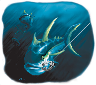
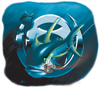
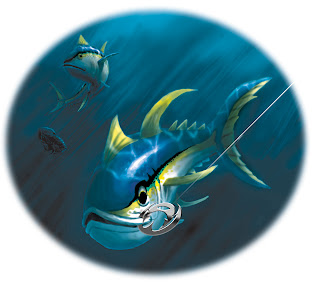
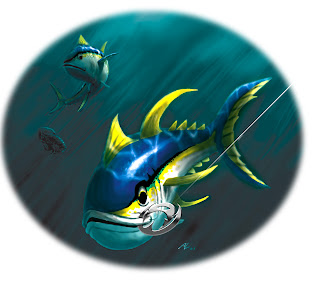
Angler Wear illustrations
Originally the post was just supposed to say," Here are some progressive illustrations for my illustration for Angler Wear." but when I uploaded the first two pics, I decided to say, what the hell happened to the color? It wasn't supposed to look like that, but I still thinks the new colors look pretty cool.
Sunday, January 27, 2008
New Year, New Website
In light of my new website, alvaroluevanos.com, I haven't been able to update this blog but don't worry I will do so from now on, on a monthly basis. I'll have upcoming projects and other good stuff. So stay tuned.
Subscribe to:
Posts (Atom)