Tuesday, November 6, 2012

Halloween Card Contest

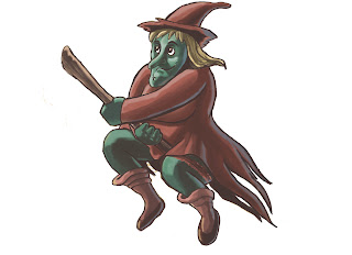
I have these card contests with my friend and fellow artist, Crystal de la Torre, on certain holidays. This past weekend we exchanged for Halloween/ Day of the Dead.  So naturally, my card had a poem I wrote about a masturbating witch.  I came up with the idea on a long drive from San Luis Obispo, it might of been the 101 highway scenery or my perverted sense of humor that fueled inspiration for this idea.  So here is the illustration I made along with the poem. Hope you guys like it. I'll post a picture of my actual card later. (Warning: Sexually suggestive humor)


9696 W. Pioneer

A lowly able woman by day,
who claims to be a 20 year divorcée.
Her laughter sounds like shrill screams to your ear,
she’s the peculiar old woman from 9696 W. Pioneer.
But I know the obvious and bitter truth,
she’s a wicked witch with a broom in her cooch!

In the mornings I see her use it with great rigor and force,
her front porch gets messy by leaves from the golf course.
At lunch, she leans it out back and gives it a rest,
because in the evening she washes it to look its very best.
At night, when all the craziness begins,
light and smoke from her house get carried by northerly winds.
Her laughter begins, first as pleasure and joy,
Then a crazy evil scream, followed by silence…oh boy.

She flies out her window, wailing so mad,
the tassels from her torn dress weren't so bad.
Until I look up and see, a broom coming from between her thighs;
but I have no idea where the other end lies.
No bristles come out from the rear of the dress,
I’m afraid of where it hides, but my mind can’t repress:
How a broom of that size, made of straw in a batch,
can fit entirely in this old witchy woman’s snatch?!

Have a Happy Halloween!

Wednesday, September 19, 2012

Stockpocalypse Contest Breakdown

Hello viewer, I'm posting my progression of a piece for a contest from deviantart.com.  The premise is I have to take one of the 3 provided stock photos and manipulate it into an apocalyptic scene.  Since I'm more of a digital painter than a photo collagist, I decided to paint my scene and then render the main focal point (the family) using filters and other methods on photoshop. My idea is of a family whose city is in ruins, trying to escape but find that the only bridge to salvation has been destroyed.  The father, an aeronautics engineer, has only enough time to retrofit a small prototype kite to his son and get him safely to the other side.  This is the stock photo I started with.

First I blocked in the main colors I was going to use and started filling in. I drew my initial concept for the rescue kite, and painted a cliff on the field. 

I continued to work mainly on the background trying to add depth and mood. At times when I had an idea for the kite I would paint it on a different layer making sure to not to get too focused on the details.

As you can see I flip my image at times just to give me a fresh look at my piece. This helps when trying to get perspective, size and composition right.  I continue with the background adding contrast and depth to the piece.  I add a filter to the family to tie it into their surroundings.

When I'm pretty satisfied with my background I begin to work on the kite concept.

I refine the kite and make sure my perspective is right, or at least not awkward. Add small details to bring the piece together and do some clean-up. This is the result.


Friday, May 4, 2012

These are some storyboards I made as a tryout for an internship I did last year.  Premise is a college student who sold pot to pay for his school gets an unexpected visit from his mother. His mother doesn't know about the girlfriend and his girlfriend doesn't know about his pot dealing days and so the following ensues. 


Thursday, June 5, 2008

Misadventures of Joe


Found these in my sketchbook. They were for my sequential art class and they had to be short one page comics done with a brush pen. I was starting a little franchise called the Misadventures of Joe and they're based on my neighbor and a few of the dumb things he does when I hang around him...but of course they are blown out of proportion in my comics. Enjoy.


Saturday, March 22, 2008

Character design- a step by step version.

This character design was for my advanced digital illustration class using Corel Painter. This is my second project using Painter and I have to say that I really like the results. I love the way you can use different media in Painter and have a great painterly quality to it. This is a step by step on how I came to the final piece....which is still not finished.


This was the initial sketch I had started with. Very rough and fast sketch. I was just trying to get his pose just right.


After re-drawing it on Painter (I think I should of just made a better sketch of the sheriff then scanned it in, very big pain in the ass redrawing it again...oh well live and learn) I started blocking in color and even starting some of the detail on his face and adding the shadow which I knew I wanted from the start.


Then came the issue about his rifle. My initial sketch of the supposed 1850's Winchester rifle came out like a amalgam of an AK-47 and a shotgun. So I had to go to some sources to get it right...as showed below.


Then come the highlights. I started with the rifle and his hands first because I knew I wanted that whole area to be the focus of this illustration. That and his facial expression.

I added the drop shadow across his stomach and darkened up the darks on his body.
Then I finished shading in the rest of the figure,cleaned it up, added some more detail, added the urn, cleaned up the figures cast shadow and added a photoshopped background
Here is the cropped off version. I still need to refine the background more and make that urn look better, I'm just not feeling it. I kinda ran out of time. But the important parts (which is the Sheriff himself) are done.


Thursday, February 14, 2008

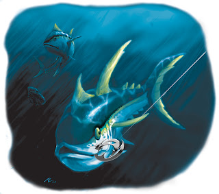
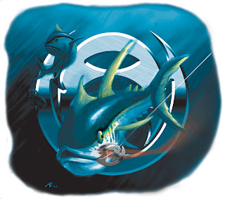
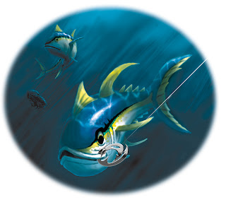
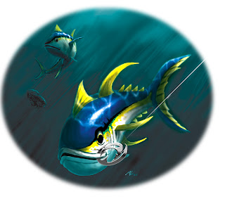
Angler Wear illustrations


Originally the post was just supposed to say," Here are some progressive illustrations for my illustration for Angler Wear." but when I uploaded the first two pics, I decided to say, what the hell happened to the color? It wasn't supposed to look like that, but I still thinks the new colors look pretty cool.

Sunday, January 27, 2008

New Year, New Website

In light of my new website, alvaroluevanos.com, I haven't been able to update this blog but don't worry I will do so from now on, on a monthly basis. I'll have upcoming projects and other good stuff. So stay tuned.